Patterned vs Solid Color Sheets: How to Choose the Perfect Look for Your Bed
Not sure whether to choose patterned or solid color sheets? Discover how color, pattern, room size, and lifestyle affect your decision, plus tips for mixing both like a designer.
Choosing between patterned and solid color sheets is about much more than taste; it shapes the mood of your bedroom, how easy it is to style, and even how calm or energized you feel when you walk into the room and crawl into bed.
Both options have clear pros and cons, and the best choice often comes down to how they work with your existing decor, your lifestyle, and the atmosphere you want to create.
Patterned vs Solid: The Big Picture
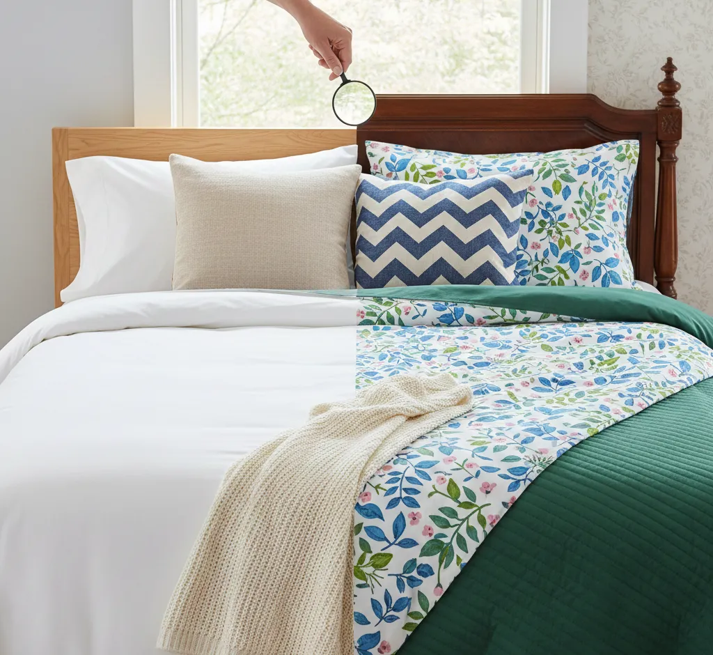
Patterned sheets act like visual "personality pieces" in your bedroom, drawing the eye, adding interest, and often becoming the focal point of the bedscape.
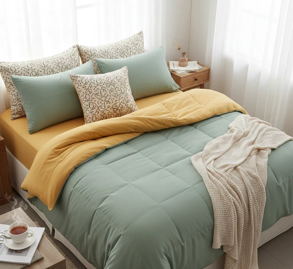
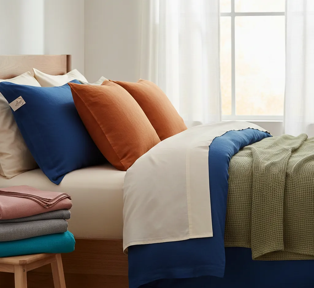
Solid sheets, on the other hand, are versatile building blocks that create a calm foundation, work with almost any style, and make it easy to update your space simply by changing pillows, throws, or a duvet cover.
When Patterned Sheets Shine
- Visual interest: Patterns add movement, depth, and character, keeping a bedroom from feeling flat or overly minimal.
- Style statement: Florals, geometrics, stripes, and abstract prints can instantly communicate a style story, from romantic and vintage to modern and graphic.
- Camouflaging power: Busy or medium-scale patterns are excellent for disguising small stains, pet hair, or light wear between washes.
When Solid Sheets Are the Better Choice
- Timeless and flexible: Solid sheets rarely go out of style and can transition easily when you repaint walls, swap furniture, or change your bedroom theme.
- Calming effect: A simple block of color can feel restful and spa-like, especially in soft neutrals or muted tones.
- Easy to coordinate: Solids make it simple to mix in bolder elements elsewhere, like patterned duvets, decorative pillows, or statement headboards.
How Sheet Design Affects Mood
Color and pattern play a powerful role in how a bedroom feels; what you see every night before sleep can either soothe you or overstimulate you.
Understanding basic color psychology and pattern scale helps you choose sheets that support the mood you want, whether that is serene, cheerful, romantic, or crisp and hotel-like.
Color Psychology Basics
- Neutrals (white, beige, grey, taupe): Create a calm, airy, and versatile base that feels clean and uncluttered. Great for minimalist and hotel-inspired spaces.
- Blues and greens: Often associated with calm, nature, and restfulness; ideal for those who want a sleep-focused retreat.
- Warm tones (blush, terracotta, soft gold): Add warmth and coziness without being overwhelming when used in muted or dusty shades.
- Bold colors (navy, emerald, charcoal, deep plum): Bring drama and sophistication; they work particularly well in larger rooms or spaces with plenty of natural light.
How Patterns Change the Feel
- Floral prints: Can feel romantic, soft, and inviting; smaller florals often read as classic and gentle, while large-scale blooms feel more dramatic.
- Geometric patterns: Lines, grids, and shapes lend structure and a modern, tailored feel; they suit contemporary or minimalist interiors that still need some visual energy.
- Stripes and checks: Classic and versatile, these can skew traditional, coastal, or modern depending on width and color.
- Abstract or artistic prints: Ideal if you want a creative or eclectic atmosphere, especially in rooms with otherwise simple furniture and walls.
Room Size, Light, and Architecture
Your room’s dimensions and lighting should guide whether you lean toward bold patterns, delicate prints, or soothing solids.
The same sheet set can feel very different in a small, low-light bedroom compared with a large, sun-filled space.
Small Bedrooms
- Light-colored solid sheets help open up a small room, reflecting more light and minimizing visual clutter.
- If you love patterns, opt for subtle, small-scale prints in light or mid tones so the bed doesn’t dominate the entire space.
- A good compromise is a mostly solid sheet with a delicate border, pinstripe, or tiny motif that adds interest without overwhelming the eye.
Large or Airy Bedrooms
- Bigger rooms can comfortably handle bolder patterns, darker palettes, and larger-scale designs without feeling crowded.
- Patterned sheets can help visually "fill" the space and make a large bedroom feel cozier and more intentional.
- Combining a bold patterned duvet with coordinating solid sheets is an effective way to strike a balance between drama and calm.
Natural vs Artificial Light
- Rooms with abundant daylight can support deeper colors and more saturated patterns because the light prevents them from feeling heavy.
- In darker rooms, very dark or dense prints may read as gloomy; consider mid-tone solids or patterns with a light background.
- Warm-toned sheets can counter cool, bluish artificial light, while cooler tones can refresh warm, yellow lighting.
Style Matching: Aligning Sheets with Your Decor
Before choosing patterned or solid sheets, look at what already dominates your bedroom: the wall color, flooring, furniture, and existing textiles like rugs or curtains.
Your sheets should work with these elements rather than compete, creating a cohesive and layered look.
Minimalist and Modern Spaces
- Solid sheets in white, soft grey, or muted earth tones deliver a clean, uncluttered look that fits minimalist aesthetics.
- If you want pattern, consider very simple designs like thin stripes, small grids, or tone-on-tone jacquard textures.
- Limit yourself to one main pattern in the room (for example, on the duvet) and keep sheets solid or extremely subtle.
Classic, Traditional, or Cottage Style
- Delicate florals, damask-inspired motifs, or ticking stripes pair beautifully with carved wood furniture, vintage pieces, and layered textiles.
- Balance bolder prints with solid pillowcases or a solid blanket folded at the foot of the bed to keep the look refined.
- Consider a palette of soft blues, creams, greens, and blush tones to preserve a timeless, cozy feeling.
Eclectic, Boho, or Artistic Rooms
- Patterned sheets can be a playground for color and print in creative spaces, from botanicals to geometrics and ethnic-inspired motifs.
- To avoid chaos, repeat a few key colors across sheets, pillows, and throws so the look feels collected rather than random.
- Layering different pattern scales (small print sheets, medium-scale pillows, large-print duvet) creates a curated, designer-worthy feel.
Practical Considerations: Maintenance and Longevity
Beyond aesthetics, think about how you actually use your bed: Do you eat, work, or spend time with kids and pets there? Do you prefer crisp white hotel sheets or something that can hide everyday life a little better?
These real-world details often determine whether patterned or solid sheets will be easier to live with over time.
Stain Visibility and Wear
- Medium and dark solid colors tend to hide small marks better than bright whites or pastels, though they may show lint or pet hair more clearly.
- Patterned sheets are excellent at disguising light stains, uneven fading, or slight discoloration from frequent washing.
- Crisp white or very light solid sheets look fresh but demand more vigilance with spot treatment and regular laundering.
Trend Resistance
- Simple solid neutrals (white, cream, light grey, soft beige) are the most timeless and unlikely to feel dated.
- Trendy prints or bold color combinations may feel exciting now but could start to look tired faster; reserve them for secondary sets if you worry about longevity.
- If you love pattern but want long-term appeal, choose classic motifs like subtle stripes, checks, or small-scale florals in muted colors.
Mixing Patterned and Solid Sheets Like a Designer
You don’t actually have to choose one side; some of the most polished beds intentionally mix patterned and solid elements for balance.
By repeating colors and controlling the scale of patterns, you can create a layered, designer look that feels both intentional and inviting.
Start with a Solid Foundation
- Use a solid fitted sheet as the base, then add a patterned flat sheet, shams, or duvet cover that pulls in the same key color.
- Pick one main accent color from the pattern and repeat it in at least one solid piece (like a throw blanket or an extra pillow).
- If your duvet or comforter is busy, keep pillowcases or the top sheet solid to give the eye a place to rest.
Play with Scale
- Combine a small-scale pattern on the sheets with a medium- or large-scale pattern on the duvet or decorative pillows.
- Avoid using several patterns of the same scale and intensity; they can visually compete and feel chaotic.
- Use solids to separate patterns—for example, patterned sheets, solid blanket, patterned throw pillow—to create a structured, cohesive story.
Choosing Sheets for Different Lifestyles
Your household situation, routines, and preferences should heavily influence whether patterned or solid sheets suit you best.
The right choice for a design enthusiast who restyles their bedroom seasonally may be very different from what works for a busy household with kids and pets.
For Families and Pet Owners
- Durable fabrics and patterns that can hide the occasional paw print or snack spill often make patterned or mid-tone sheets a smart pick.
- Look for prints that are not too pale and not too dark, so they disguise both light and darker marks reasonably well.
- Having at least one extra set of coordinating solid sheets makes it easy to rotate while keeping your bed looking pulled together.
For Minimalists and Busy Professionals
- Solid sheets in a limited palette (for example, white, stone, and charcoal) streamline laundry and bedding changes.
- Sticking to solids lets you mix any piece with any other, so making the bed looks intentional even if you grab whatever is clean.
- Adding subtle texture—like percale for crispness or sateen for sheen—can keep simple solids from feeling boring.
For Design Lovers Who Like to Refresh Often
- Invest in a few high-quality solid basics, then layer in seasonal or trend-forward patterned sheets to change the look.
- Rotate patterns with the seasons: lighter florals or coastal stripes in warmer months, deeper tones or plaids in cooler months.
- Keep your wall color and large furniture relatively neutral so you have more freedom to play with bold sheet sets.
How to Decide: A Simple Framework
If you are torn between patterned and solid sheets, walk through a few quick questions to clarify what will work best in your specific space.
Thinking through mood, maintenance, and how often you like to restyle your space will help you land on a choice that feels right long term.
Key Questions to Ask Yourself
- What mood do I want? Calm and serene usually leans toward solids or very subtle patterns; energetic or expressive supports bolder designs.
- How busy is my bedroom already? If your walls, rug, or curtains are loud, solid sheets can provide balance; if the room is plain, patterned sheets might add needed personality.
- How much maintenance do I want? If you worry about stains or don’t want to bleach whites regularly, consider mid-tone solids or patterned sets.
- Will I change my decor soon? If yes, choose versatile solids or classic patterns that can transition across color schemes.
- Do I love the pattern enough to see it daily? Sheets are a large visual surface; pick designs you are confident you will enjoy over time.
Final Thoughts: You Don’t Have to Choose Just One
Choosing between patterned and solid color sheets is less about strict rules and more about finding a combination that supports your lifestyle and reflects your personality.
Most bedrooms benefit from a mix of both over time: a few hardworking solid basics and one or two patterned sets that bring in character, color, or a seasonal mood, so your bed always feels fresh, inviting, and distinctly yours.